BABCOCK
Design of a series of internal communications projects including the award winning 'Raising The Bar' programme.
Identity and branding design for this international defence, aerospace and security company for a number of internal comm initiatives.
BABCOCK
Design of a series of internal communications projects including the award winning 'Raising The Bar' programme.
Identity and branding design for this international defence, aerospace and security company for a number of internal comm initiatives.
BABCOCK
Design of a series of internal communications projects including the award winning 'Raising The Bar' programme.
Identity and branding design for this international defence, aerospace and security company for a number of internal comm initiatives.
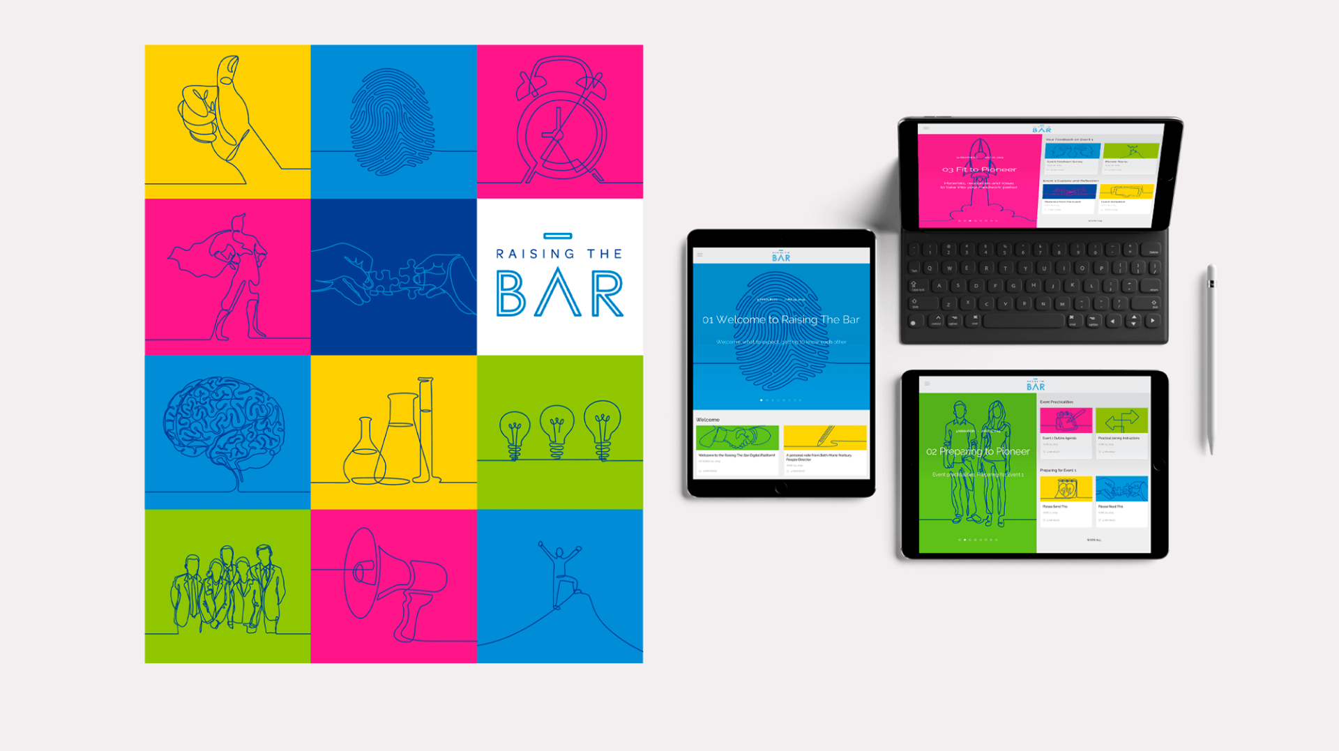
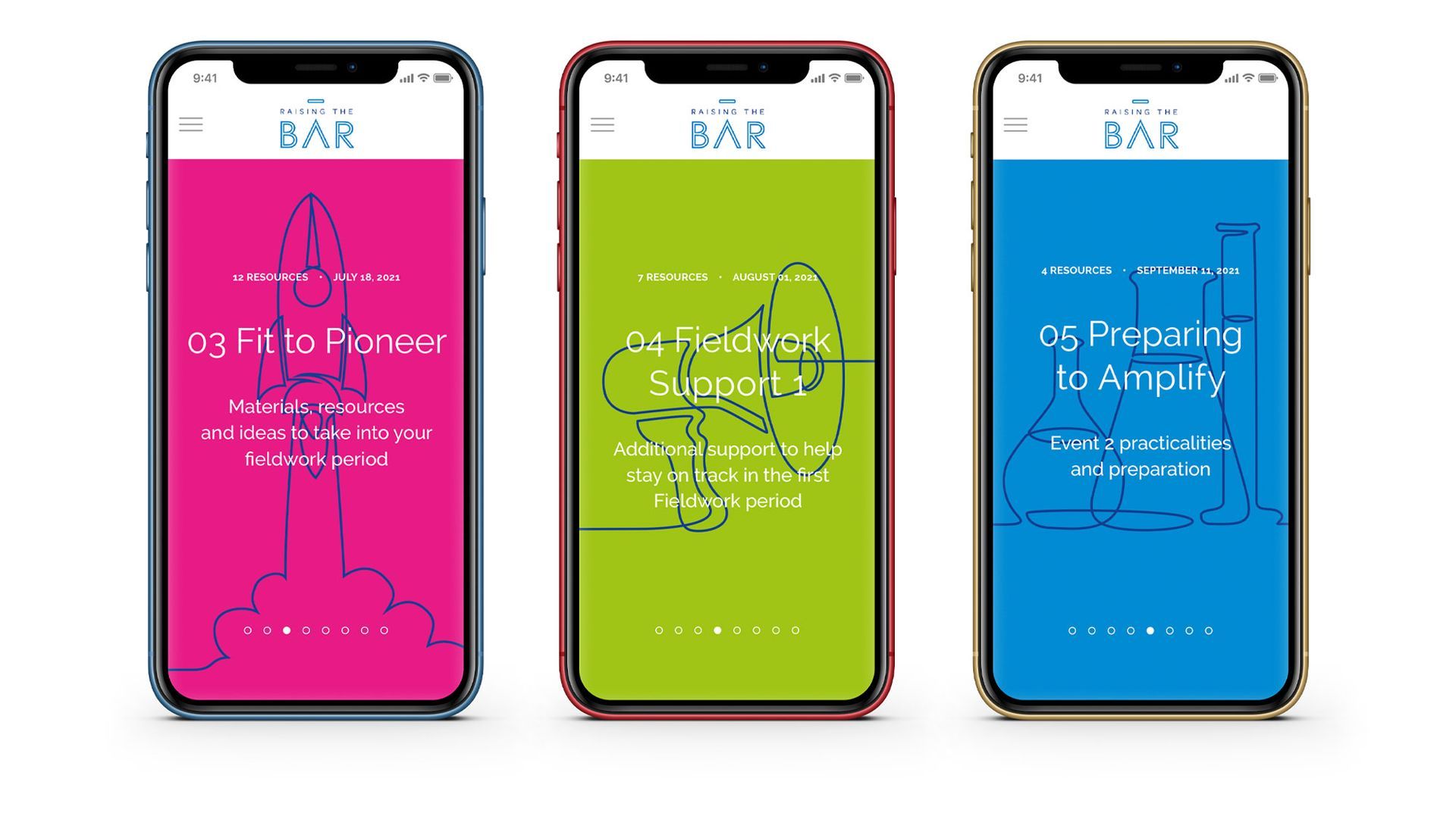
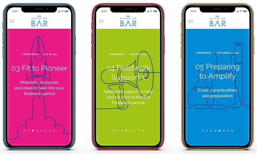
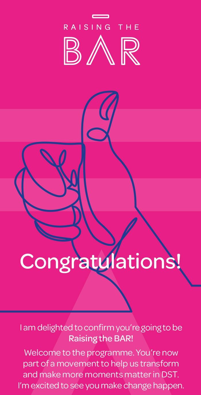
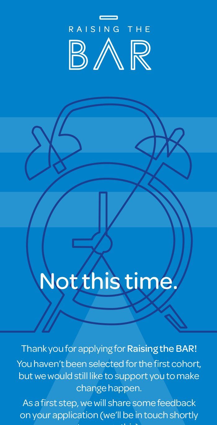
The ‘Raising The Bar’ name came about through Babcock’s company values – Brave (B), Adapt (A) and Respect (R) and were incorporated in the new programme logo and subsequent branding.
We selected an engaging font, stylised to outlines, edited and detached the horizontal bar element of the ‘A’ and elevated it sit at the summit of the logo, to give that visual representation of the raised bar! By doing this, it created a stylised arrow symbol pointing upwards (again, another visual ‘pointer’ to raising/elevating). A bright and vibrant colour palette was suggested, together with loose hand-drawn style illustrations for supporting graphics to supplement headline text.
Supporting material was produced across digital – including website applications, animated GIFs, playbooks and PowerPoint presentations, as well as print materials – including teaser posters, mailers, games and conversation cards.
Let’s create together
By email
makeityourdesign@btinternet.com
In person
3 Colbeck, Church Crookham, Fleet, Hamphire GU52 8XQ
Give me a call
07720 297731
Contact Us
We will get back to you as soon as possible.
Please try again later.